Redesigning Our Logo and Color Palette
At Patch Monkey, we believe that a brand’s visual identity plays a crucial role in connecting with customers. That’s why we’re excited to share our decision to redesign our logo and refresh our color palette with a playful and minimal approach that better reflects the spirit of our company.
The original design
The vision for something new
Our original design has served us well, but we wanted to create something that would:
Feel more playful and approachable. A lighter, more playful design aligns with our emphasis on creating software that humans enjoy.
Be minimal and versatile. We aimed for a logo that is easily recognizable in all formats—whether on a website, in monochrome or on solid backgrounds, printed on merchandise, or even as a tiny app icon.
A nod to our Oklahoma City origins. In redesigning the logo, we also wanted to pay tribute to our roots in Oklahoma City. The new color palette takes inspiration from the rich, earthy tones of downtown Oklahoma City’s iconic red brick buildings.
Brainstorming
The branding process was iterative, and it was important to include some callbacks to our original design. I wanted to keep the overall concept of the logo and wordmark, meaning a monkey’s head in profile and the words “patch” and “monkey” stacked onto one another.
From there, I had the idea of combining the ideas of a cute monkey and the symbol for merging a patch into a codebase. In the early iterations (on the left in the image above) the left eye and the corner of the mouth were connected in an effort to reference git branching and git commits. After struggling to realize that vision into something we’d be happy with, I opted to for a more literal interpretation, a monkey wearing an eye patch.
The results
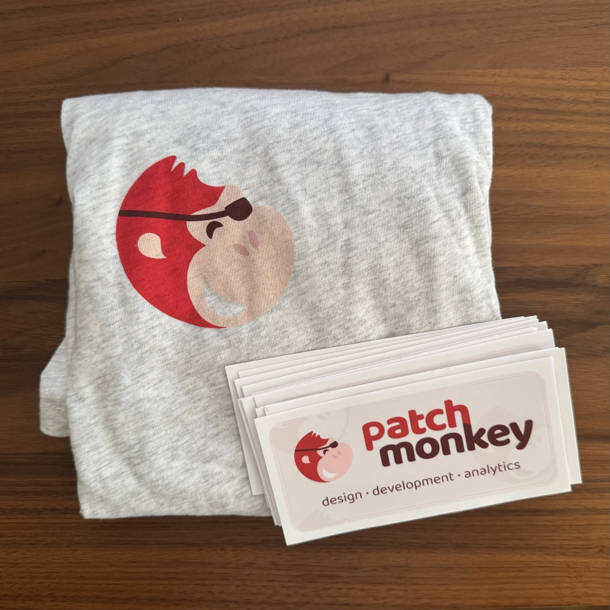
After several rounds of iteration, we ended up with the following logo, wordmark, and color palette, and we are excited to move forward!


